FREE Sign Up to our Latest E-Tips from RADICA
“Marketing Automation” has been a life-changing impact in recent decades, so as has “Customer Journey” been in your marketing system. In short, customer journeys are processes supported by software to automate your participation in the daily customer journey with multi-touchpoint and multi-channel customer journeys simultaneously. Start with triggers and action according to conditions.
What do you need to stay in the 67% and genuinely benefit the best from your journey?
A goal is practically the heart of your marketing automation journey. A complete understanding of the goal of your automated email series is a determinant to deliver the correct values of your business. Clarifications are essential before proceeding to designs and content writing. Remember to maintain a balanced goal, do not be too sophisticated, or it may backfire. Try not to overwhelm your customers with heavy content emails. Separate them into different stages along your journey, create a series to maximize the value of each email.
Do not let this idea slides away because it sounds like additional hours of scheduling and monitoring. Marketing automation is here to benefit you. All you have to do is determine the goal of the emails in the series, prepare the content and let them automate.
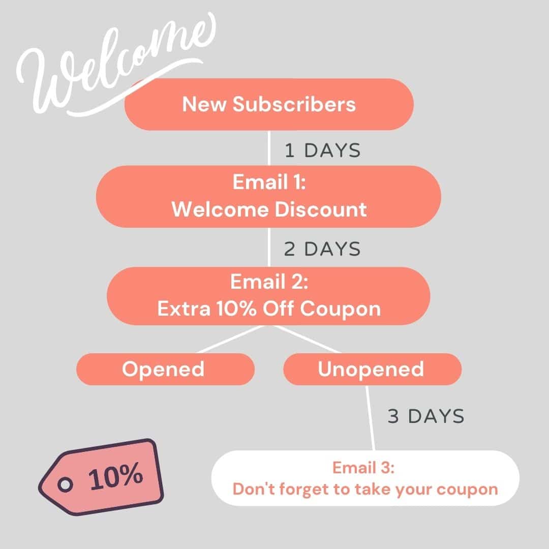
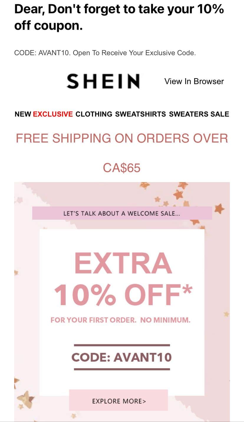
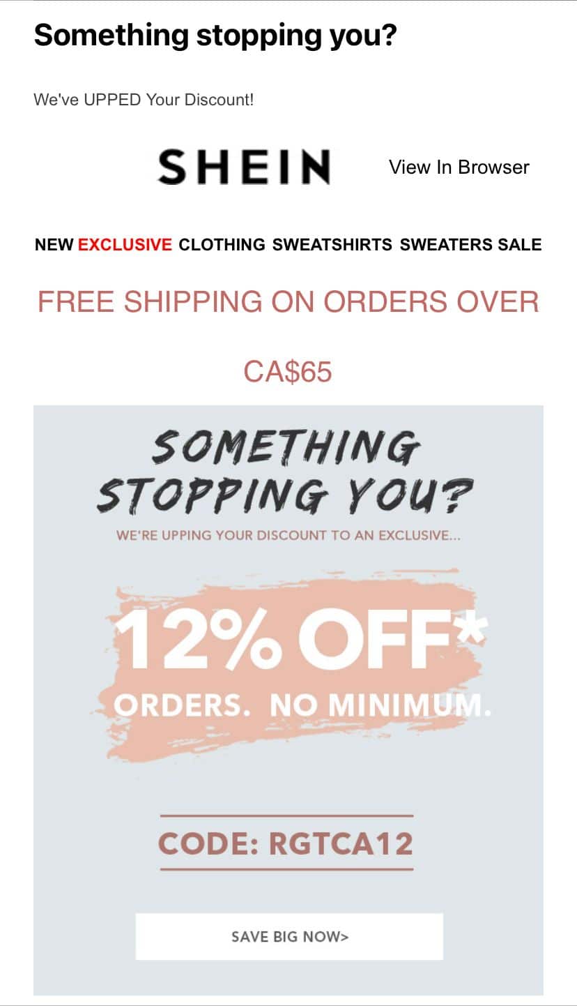
For example, the goal of the first email is to encourage new subscribers to purchase after signing up, what if still no response after another 2 days? Do not lose hope in your second email. Review your goal and the incentives provided. Modify it by upgrading the offer within budget. Then, send a third email with upgraded offers to those who have not purchased something yet. SHEIN upgraded their discounts to 12% off to boost re-engagement. The above email series is all done by automation. They are great ways to stay engaged with your audience and give you the spaces and freedom you need to express your brand better than ever.
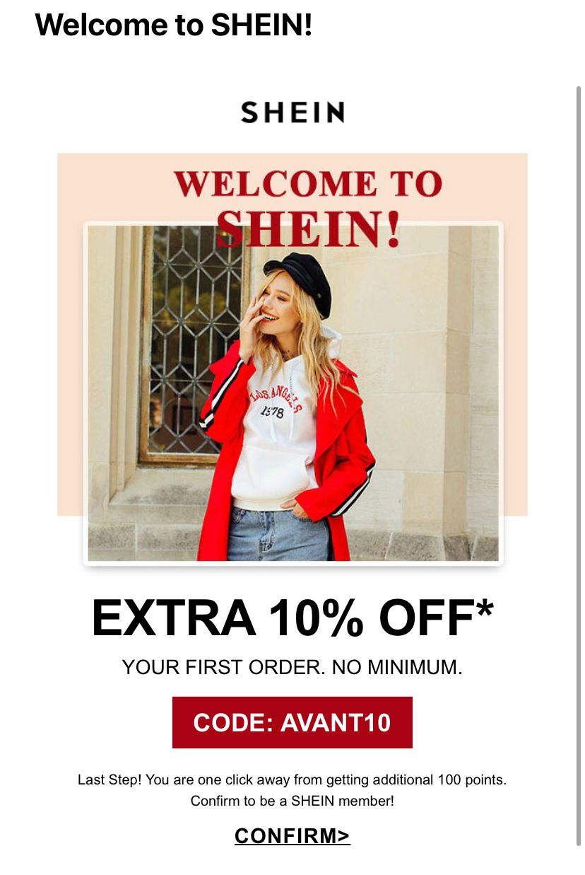
1. Welcome email with welcome benefits
Be aware that spam is spam because customers don’t need it. We trust you can do better than that. Any journey has an exit, and you have to stay on top of customers’ minds if you want to distance them away from the emergency exit. With marketing automation, you can utilize all information and content down to your prospects based on personal interest in different time horizons.
Useful and diversified content flows are what emails should deploy. Spend the saved time and cost wisely in studying customer behaviors and needs in creating relevant content for them. Glam your value in business and surprise customers with your relevancy. Make them feel special if you want to be special to them.
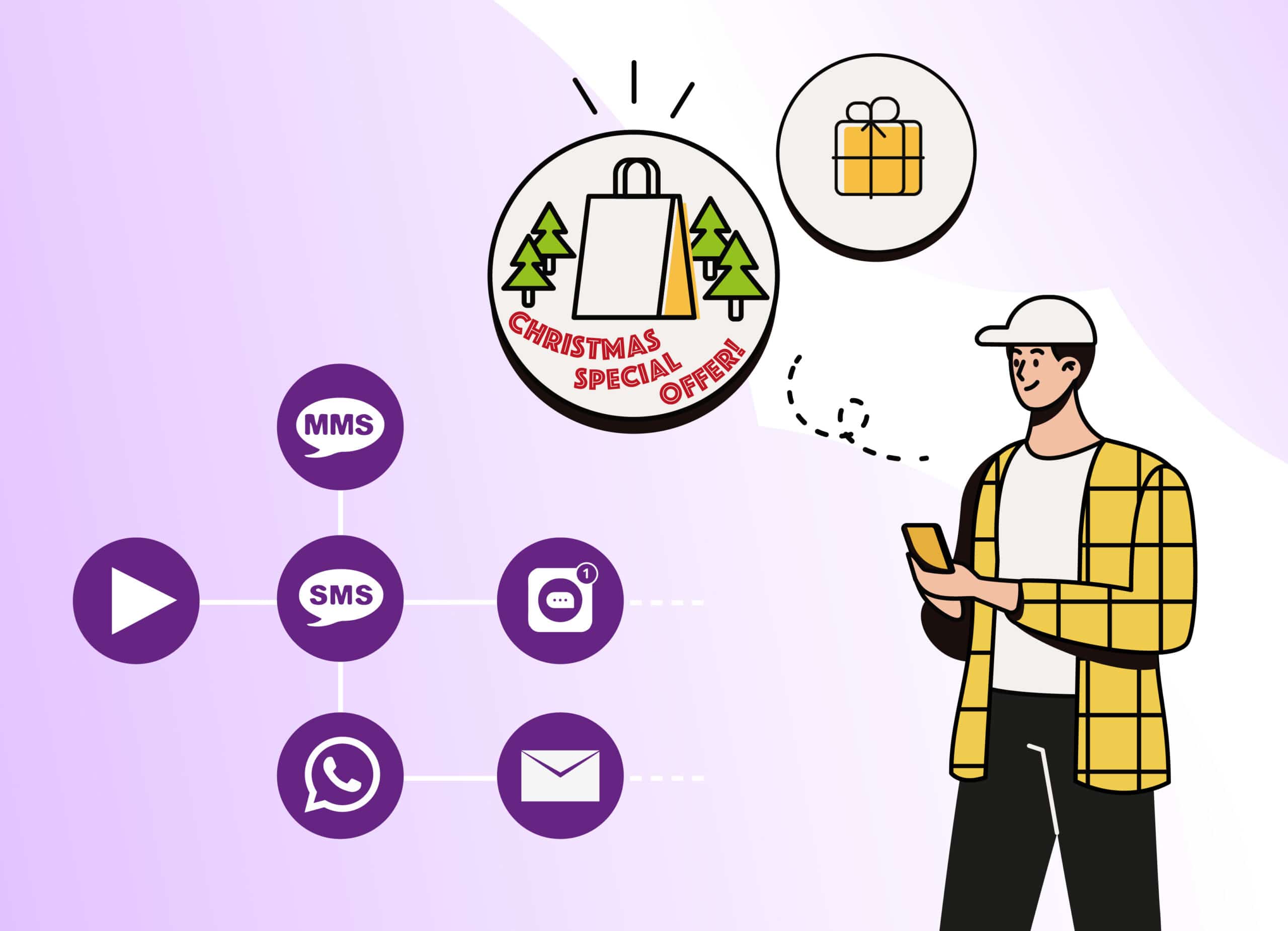
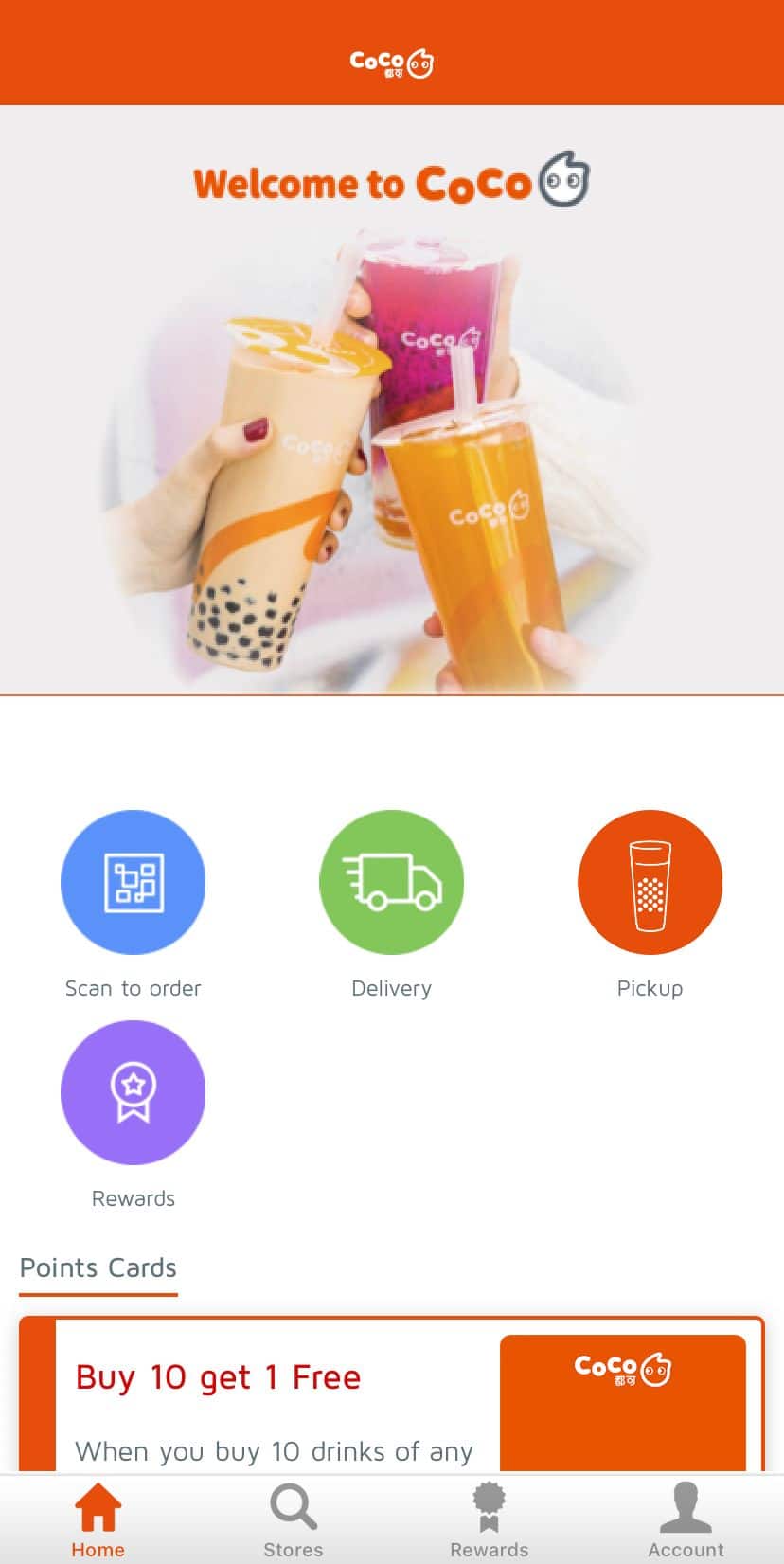
Marketing automation is robust not just for a single channel but in multiple. It provides an opportunity for brands to offer a seamless omni-channel customer experience. A quick review about omni-channel – a centralized platform where all active channels communicate with one another based on customer interactions with specific channels. It enable brands to reach out to audiences at all points of their customer journey, even if they jump from one channel to another. For example, milk tea brand CoCo launched its own mobile app and extended the interaction with SMS messages. While the app focuses on most promotions and marketing materials just like their website, SMS functions as a reminder for order pick-up, targeting customers who prefer text messages. It plays a key role in this seamless user experience and raises engagement rates. Do not overlook to drive across omni-channel with it.

A quick look at two typical types of content in an marketing automation customer journey:
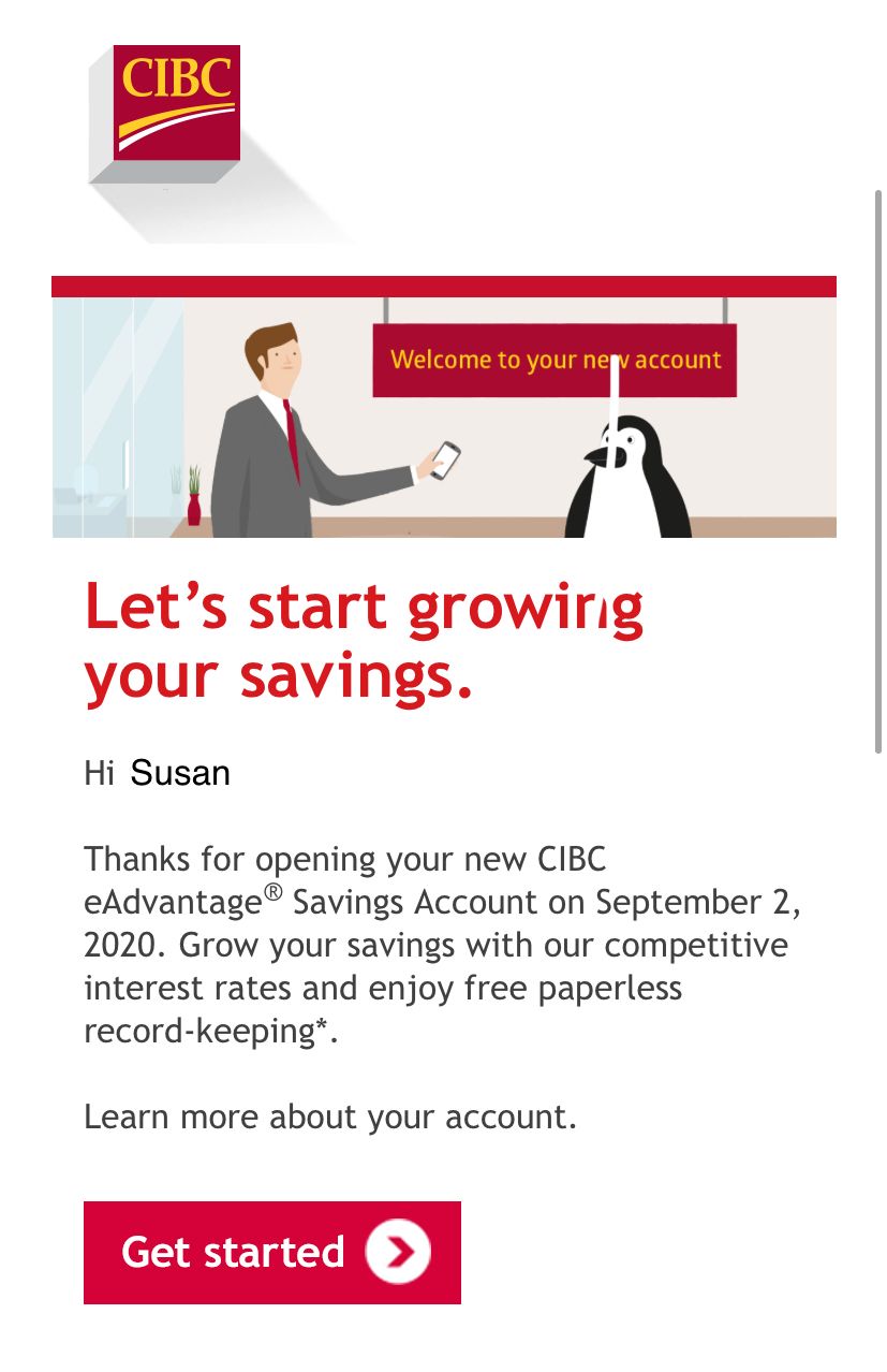
Here’s another example of a welcome email and how to better design it. A welcome email is the start of a customer journey, customer enters and tell you they are interested in your product or services and are asking for assistance. According to 9clouds, welcome emails have 86% higher open rates than other emails, and subscribers who receive these emails are 33% more engaging in long-term brand engagement than those who don’t. Visuals are powerful. A well-designed email with a distinct theme makes a positive first impression. Spice up your mail a bit by including an unique value if possible. Subscribers will love it more to continue the journey with you. Don’t forget a call-to-action button if you don’t want to end your journey at the beginning. Simple and useful. That’s all you need in one mail. One main message is enough, especially in more functional-based industries such as financial institutions. Guide them to explore more on your website and stay curious about you!
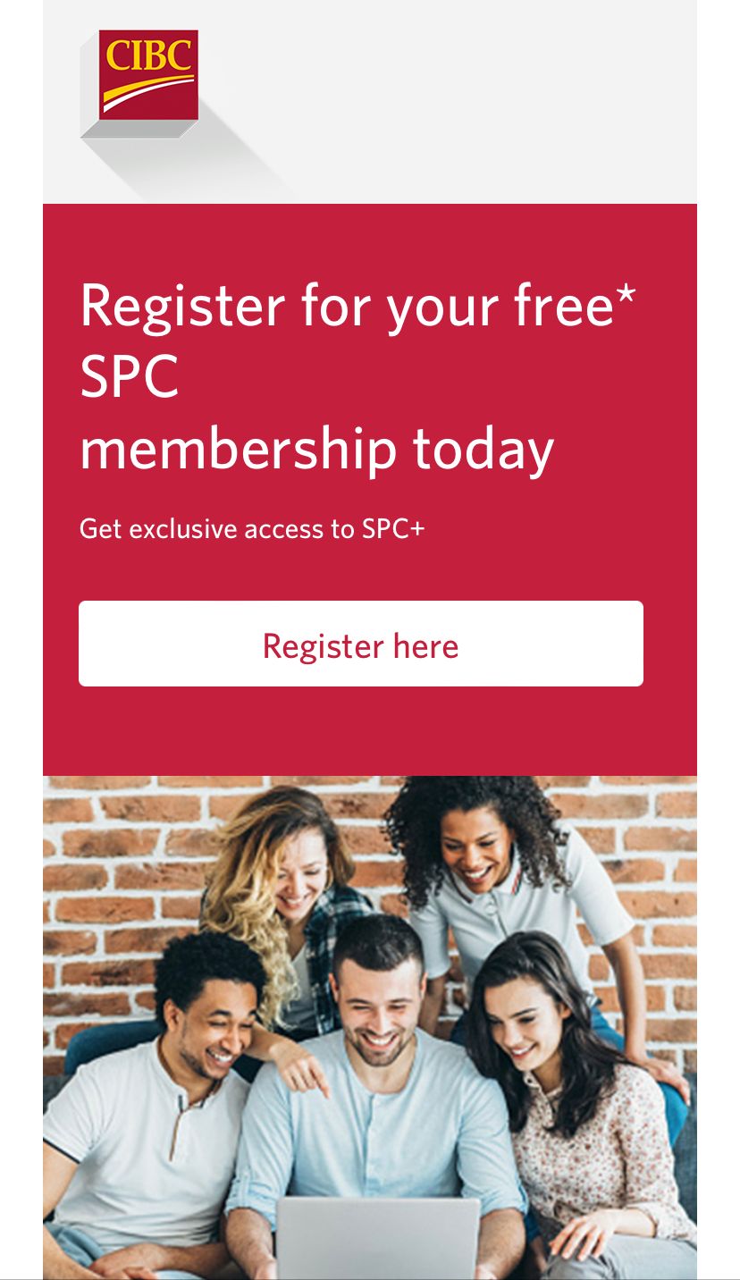
However, it does not mean you have to end your client’s onboarding journey with one single email. After a new saving account, CIBC noticed that their youth client haven’t registered for SPC+ membership and automatically sent another email in approximately two weeks to remind clients to register for their free SPC membership for more discounts and experiences.
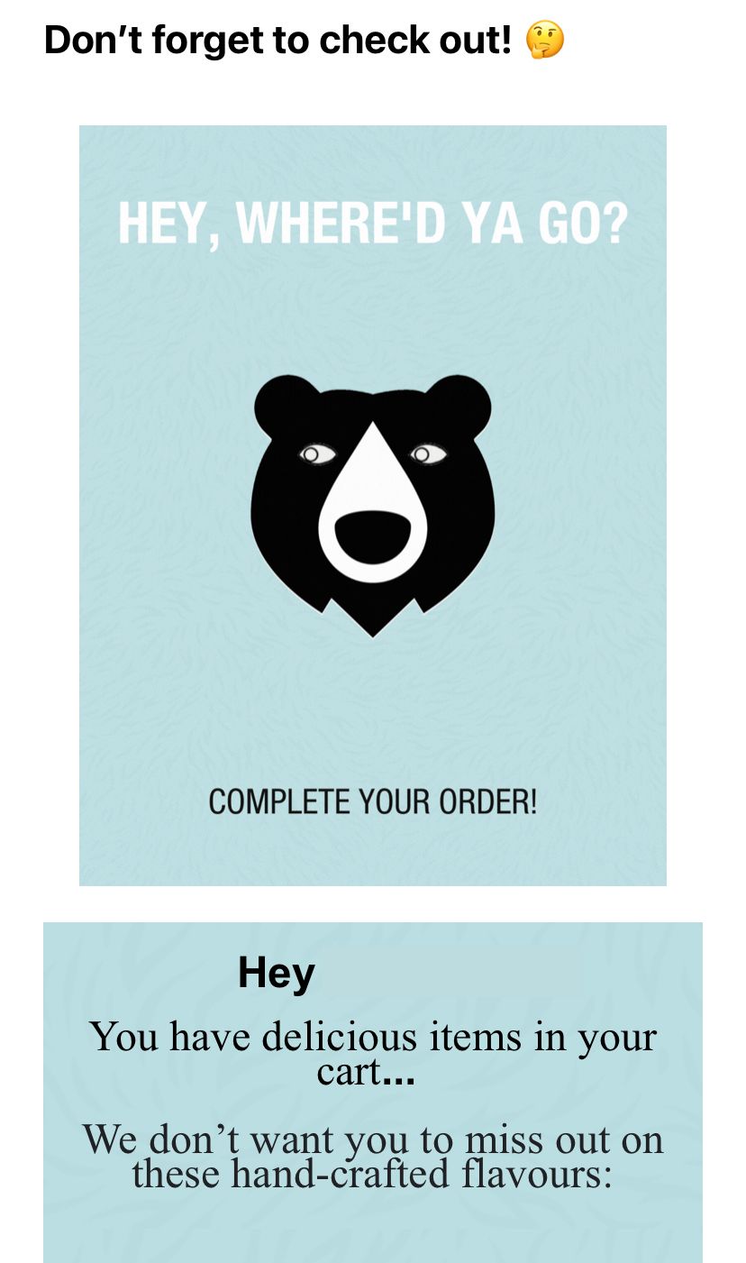
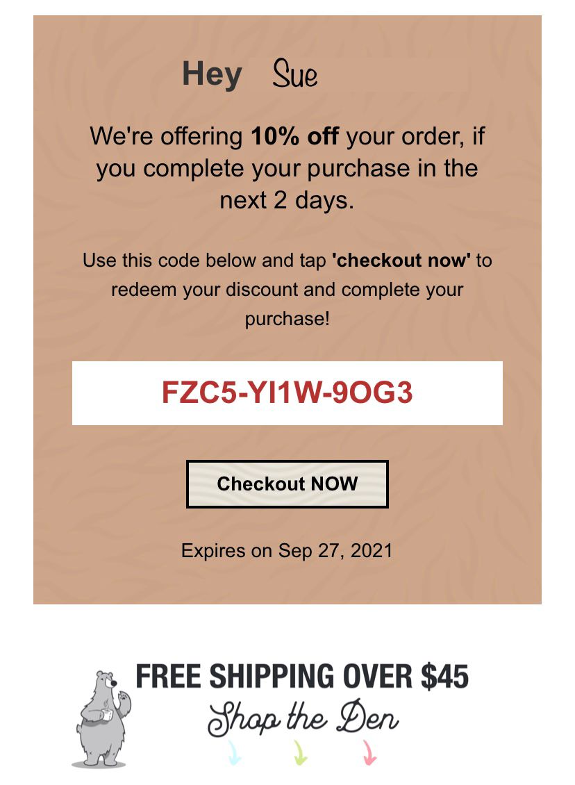
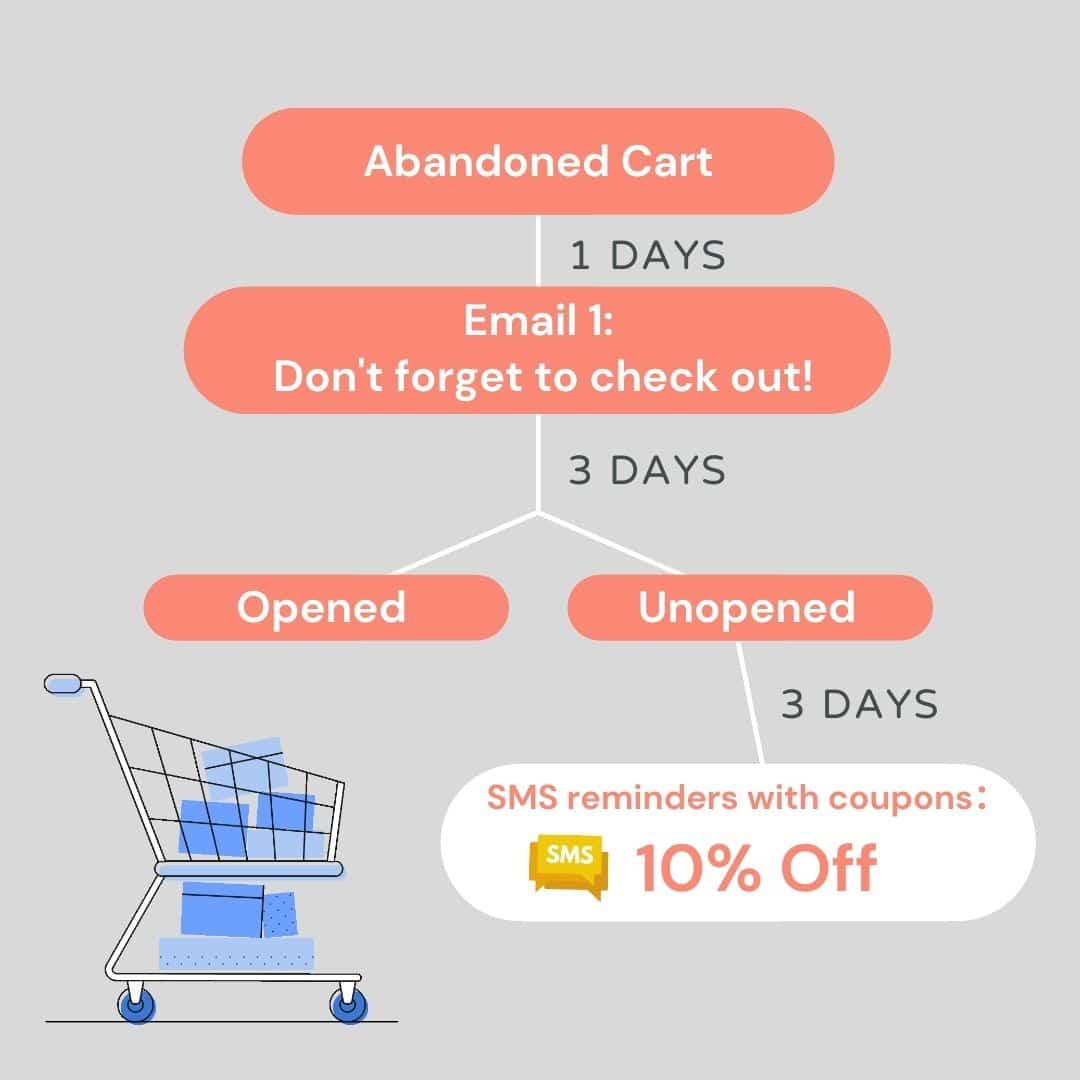
Let’s begin with a simple statement here. Abandoned cart emails are automated and are effective. Mooseend found that 45% of all abandoned cart emails are opened, 21% are clicked, and 50% of those clicks drive back traffic and recovered purchases. Abandoned cart email is an anchor in your customer journey that deserves as much time as a promotion email. Subject lines and designs matter. Look at the following example of a Canada-based oat milk coffee brand TWO BEARS. They sent out the first abandoned cart email with the subject line “Don’t forget to check out! ” after subscribers left their cart on hold and did not proceed to check out. This email acts as a reminder for subscribers to clear the cart. After a day, they sent a follow-up email with an additional 10% off as the subscriber did not take any action to finish the purchasing process. Instead of a one-time reminder, utilize marketing automation to send out a couple or even a series of emails according to the audience’s reactions.
Now that you have a clearer picture of how to be benefit from implementing marketing automation to your email marketing strategy, you should also know that whatever your industry, a devising journey is a winning strategy for your business.
Are you ready to put the theories into action with the right tools?
Contact US
Features Articles
Get ready to find a professional email marketing company in Hong kong?
About RADICA
RADICA is a Hong Kong leading email marketing solution provider dedicated to accelerating revenue and maximizing customer connection with customer engagement solution in B2B, B2C and E-commerce industries. With RADICA’s advanced onmichannel marketing automation platform RI+, it is much easier and effective to spread out cross-channel messages with automated and personalised journey, even with high volume within short period of time. Our clients ranging from luxury, banking and insurance to food and beverage like Chanel, BEA, LEVI’s, Chow Sang Sang and Starbucks. Since 2000, RADICA as the leading email marketing and CRM agency in Hong Kong have focused on growing the value of their customer database by making wise use of data analytics in direct marketing. Learn more Radica Systems Limited at www.radicasys.com.

